Our performance analysis reports provide simple and pre-defined views of your application's health and performance. Choose any report below to learn more:
The Background jobs analysis report helps you analyze the performance of jobs and other non-web transactions running in production that use frameworks instrumented by New Relic, such as DelayedJob and Resque. The report shows comparison information from the past 24 hours back to the past 7 days, including the amount of time spent in throughput (requests per minute or rpm), total time spent in the job, and average time to execute it.
View report in UI
To view the Background jobs analysis report for your app: Go to one.newrelic.com > All capabilities > APM & services > (select an app) > Reports > Performance > Non-web transactions tab. The default report compares the last 24 hours with the previous 24-hour period, 7 days ago, and averages over the last 7 days.
If you want to... | Do this |
|---|---|
Change the amount of detail shown | Select or clear the time period checkbox options. |
Limit the transactions that appear | Use the Filter text box. |
Change the sort order | Select one of the available options from the Sort by dropdown menu. |
Select what data appears as a bar chart | Select a Plotting option. |
View transaction details | Select the transaction's title to go directly to the APM Transactions page. |
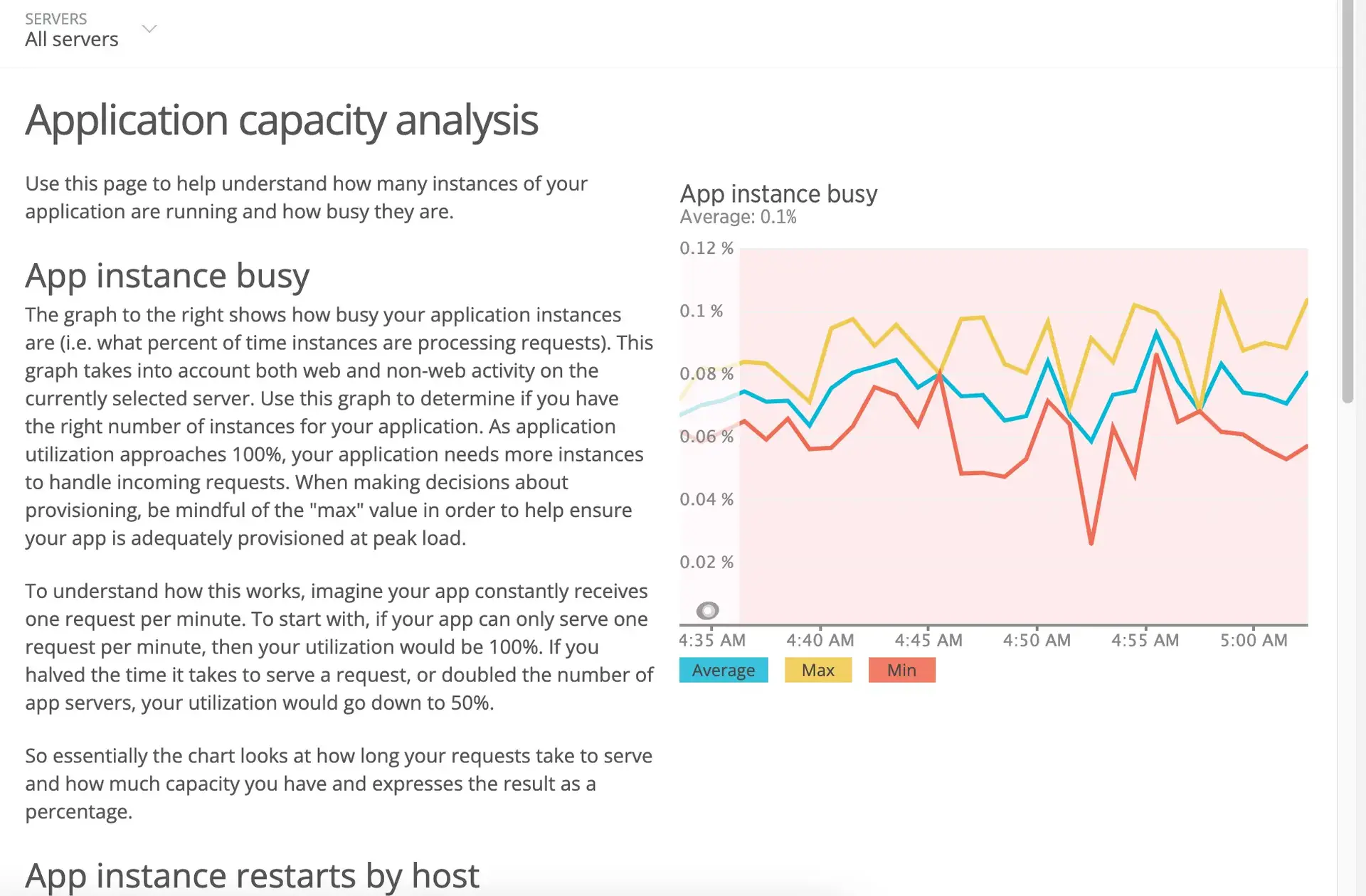
APM's capacity analysis report shows how many instances of your app are running and how busy they are. This information is useful to analyze whether your app has enough instances deployed to support request loads. You can then use this information to fine-tune your configuration for optimal performance.
The capacity analysis report is only available for Python and Ruby language agents.
View the capacity analysis report
To view the capacity analysis report for your app:
Go to one.newrelic.com > All capabilities > APM & services > (select an app) > Reports > Capacity.
Use any of New Relic's standard page functions to drill down into detailed information.

The report includes three charts.
Capacity chart
Description
App instance busy
This chart shows how busy are your application's instances as the percentage of time to process requests. This includes the average, minimum, and maximum percentages for any time period on the chart.
Use this information to determine if you have the right number of instances for your application. As application utilization approaches 100%, your application needs more instances to handle incoming requests.
App instance restarts by host
This chart shows the number of instance restarts for each time interval. Use this information to determine if your application instances are restarting too frequently.
To isolate activity to a specific host, select other hosts' titles on the legend below the chart to hide or return them to the chart.
OR:
Select your choice from the Hosts list on the APM Summary page.
App instance analysis
This chart shows the total number of instances running, along with the concurrent instance load. The concurrent instance load is the number of fully busy instances that would be needed to handle the load on the app. New Relic bases this on the average app instances value from the App instance busy chart, multiplied by the number of instances you have running.
Python single or multi-threaded apps
For the Python agent, capacity analysis reporting only works for traditional single or multi-threaded applications. This is because the way New Relic calculates a system load does not translate to co-routine based systems.
When using a traditional single or multi-threaded application, the metric information generated by the Python agent is captured and reported only if the optional C extension component can be compiled and installed. When you use co-routine based systems such as gevent or eventlet in conjunction with a WSGI server, the capacity analysis report will not show any data except for agent restarts.
APM's database analysis report allows you to analyze your application's performance from the database viewpoint, from the past 24 hours back to the past seven days. It shows comparison information for transactions, including the amount of time spent in throughput (operation requests per minute or rpm), total time spent in the operation, and average time to execute it.
View the database analysis report
To view the database analysis report for your app: Go to one.newrelic.com > All capabilities > APM & services > (select an app) > Reports > Performance > Databases tab. The default report compares the last 24 hours with the previous 24-hour period, 7 days ago, and averages over the last 7 days.
If you want to... | Do this |
|---|---|
Change the amount of detail shown | Select or clear the time period checkbox options. |
Limit the transactions that appear | Type the value in the Filter text box; for example, to show only transactions for |
Change the sort order | Select one of the available options from the Sort by dropdown menu. |
Select what data appears as a bar chart | Select a Plotting option. |
View transaction details | Select the transaction's title to go directly to APM's Database and slow queries page. |
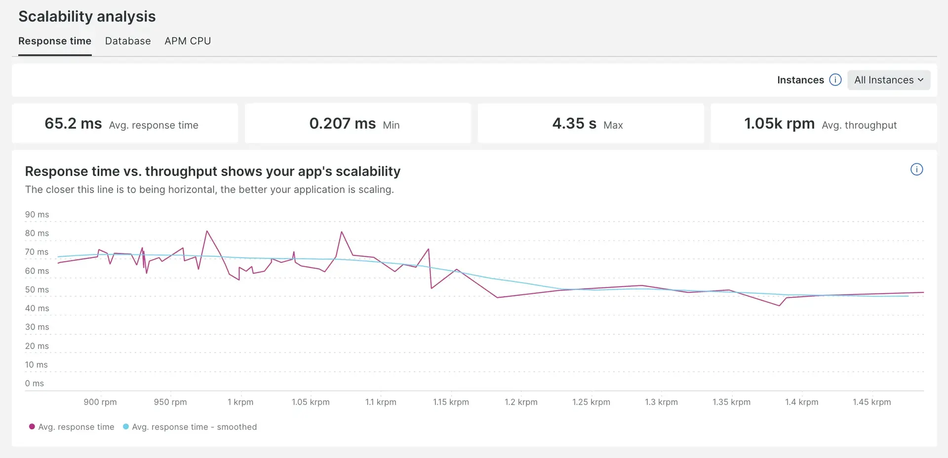
APM's scalability analysis report shows response time, database time, and CPU time in relation to the application load. This helps you evaluate performance and identify potential hardware requirements as your app grows.
View the Scalability analysis report
To view the report for your app:
Go to one.newrelic.com > All capabilities > APM & services > (select an app) > Reports > Scalability.
The Scalability analysis report includes three tabs: Response time, Database, and APM CPU. Each tab contains a billboard and a chart and represents a different aspect of performance.

Tab | Description |
|---|---|
Response time | The chart in this tab plots your application's response time, versus application load in terms of requests per minute. For an application that is scaling well, the response time should be at or close to horizontal. The billboard shows the average, minimum, and maximum response times, and average throughput. |
Database | The chart in this tab plots your application's database time versus application load in terms of requests per minute. For an application that is scaling well, you should see a roughly linear pattern in the plotted points. The billboard shows the average, minimum, and maximum database times, and average throughput. |
APM CPU | The chart in this tab plots your application's CPU time per request, versus application load in terms of requests per minute. For an application that is scaling well, you should see a roughly linear pattern in the plotted points. The billboard shows the average, minimum, and maximum CPU times, and average throughput. |
The charts feature two lines: the primary line, which connects the data points, and the secondary line, which is labeled as "Smoothed" and shows a smoothed version of the primary line. The secondary line helps visualize the application's performance without being concerned about unexpected fluctuations observed in the primary line.
These charts are constructed a bit differently from other New Relic charts and do not have the default chart actions commonly available.
Select options for time periods
The Scalability report has a time picker that allows you to view data over different time periods. The minimum recommended time period is 30 minutes because when analyzing an application’s scalability, lower time ranges don’t give a full picture. The time picker uses the default value of the last 30 minutes.
View data for individual instances
Each tab includes an instance picker which allows you to select a specific instance and the chart and the billboard will filter to the data of that instance.
APM's web transactions analysis report provides comparison information for web transactions, including the amount of time spent in throughput (requests per minute or rpm), total time in the web transaction, average time to execute it, and Apdex score. You can compare the past 24 hours of data with the previous 24 hour period, 7 days ago, and averages over the last 7 days.
Use this information to analyze which web transactions consume the most time, have the most number of calls, have the greatest number of standard deviations, and more. This information can help you identify where to fine-tune your app.
View the Web transactions analysis report
To view the web transactions analysis report for your app: Go to one.newrelic.com > All capabilities > APM & services > (select an app) > Reports > Performance > Web transactions tab.
The default report compares the last 24 hours with the previous 24-hour period, 7 days ago, and averages over the last 7 days. Apdex entries followed by an asterisk (*) indicate that more than one Apdex threshold was set for the given time period.
If you want to... | Do this |
|---|---|
Change the amount of detail shown | Select or clear the time period checkbox options. |
Limit the transactions that appear | Use the Filter text box; for example, to report only on transactions that include |
Change the sort order | Select one of the available options from the Sort by dropdown menu. |
Select what data appears as a bar chart | Select a Plotting option. |
View web transaction details | Select the web transaction's title to go directly to the APM Transactions page. |
Every Monday, New Relic sends a weekly performance report via email to any of your account's users who have selected to receive this report. The email report contains summary performance metrics for the past week for a select group of your applications. The weekly performance report is different than APM's Service Level Agreement (SLA) reports.
Important
At this time, weekly performance reports are not available for accounts in the EU region.
View example report details
To see an example of a weekly performance report for your account:
From the user menu, select User preferences.
Go down to Weekly summary emails and select See a sample email.

The performance report is split into sections:
Section
Description
Featured app
This provides both throughput pattern and performance metrics for the application with the highest call count in your account.
Applications with linked will be prioritized over those that don't, even if the call count is lower.
All apps report
This section provides important performance metrics for the 20 applications in your account with the highest call count. Metrics in this list include uptime, Apdex, load time, and throughput.
Recent events
This section contains any recent alerts, deployments you have made to your app, or other events that are recorded for applications in your account.
Selected applications
New Relic selects the top 20 apps by call count that meet these criteria:
The app must have at least 25 requests per minute (rpm) throughput.
The app must include web transactions.
Applications with linked browser monitoring will be prioritized over those that don't, even if the call count is lower.
Opt in or out of report emails
To manage your weekly performance report emails, go to one.newrelic.com, click the user menu, and select User preferences. Note that you opt in/out separately for every New Relic account you have access to.
Analyze your data
APM includes several reports in the user interface. To gather, analyze, and visualize data about your software in other formats, use query builder.