• /
  • EnglishEspañolFrançais日本語한국어Português
  • Log inStart now

Intelligent Workloads UI overview

The Intelligent Workloads Summary page serves as your central operational cockpit, bringing full-stack dependencies, golden metrics, and custom business KPIs into a single unified view. This guide walks through using the Summary page components to monitor transaction health in real time and accelerate triage when performance degrades. As you scroll, the layout systematically guides your investigation from customer-facing impact straight to technical performance drivers.

The breakdown below uses a checkout transaction degradation as a recurring example to demonstrate how each view functions during an active incident.
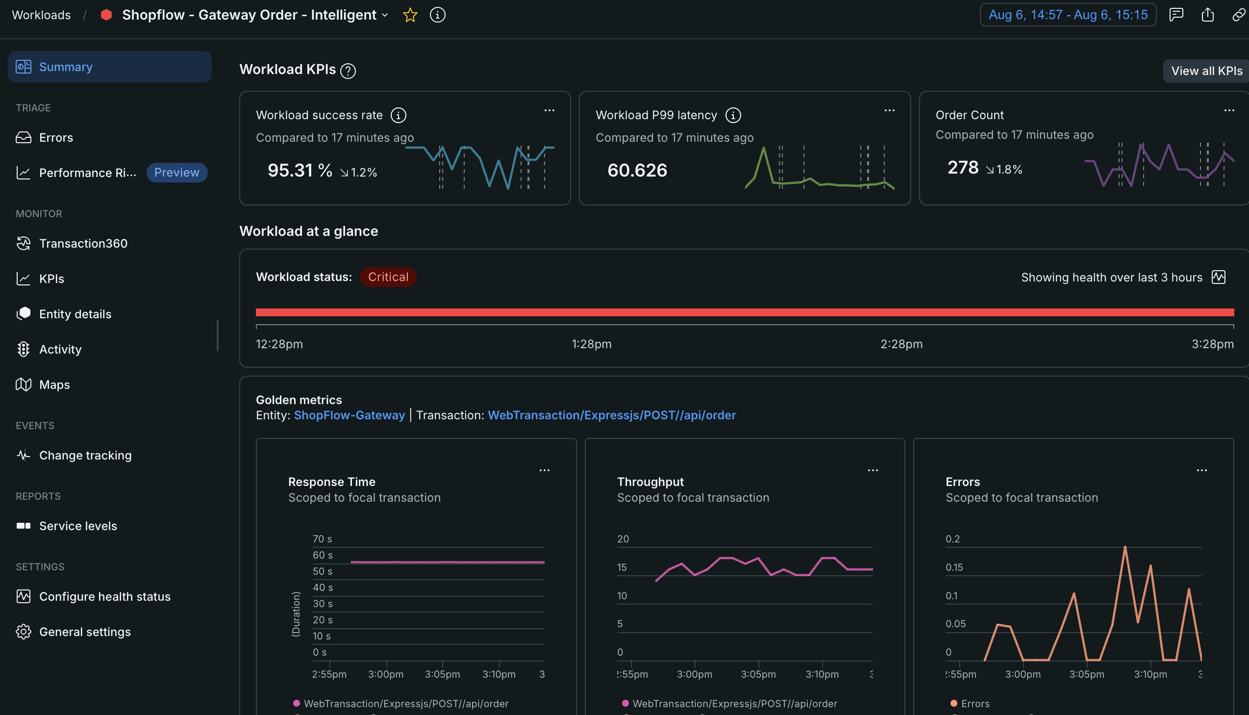
Screenshot of the Intelligent Workloads summary page showing KPI tiles, golden metrics, and participating entities

Access Intelligent Workloads

After creating Intelligent Workloads, you can access them from the main Workloads page:

  1. Go to one.newrelic.com > All capabilities > Workloads.
  2. Use the Type filter to select Intelligent.
  3. Click a workload to open its dashboard.

Once inside a workload, the left navigation gives you access to:

  • Summary: Overview of workload health, KPIs, and performance (detailed below)
  • TRIAGE: Tools for investigating issues
  • MONITOR: Different views of workload data
  • EVENTS: Track changes over time
    • Change tracking: View deployments and configuration changes
  • REPORTS: Performance reports
    • Service levels: Track SLOs and SLIs
  • SETTINGS: Configure workload behavior

AI Summary

Located at the top of the Summary page, the AI Summary automatically analyzes real-time performance data — including metrics, traces, and entity health — across all participating entities in your workload to accelerate incident response. Click Generate insights to instantly surface performance anomalies and get suggestions on where to begin your investigation. For instance, during a sudden checkout slowdown, the AI Summary can analyze your dependency chain and highlight high-latency database calls before you pull a single trace.

Requirements:

Important

Pricing: AI insights generation incurs additional costs based on your New Relic AI usage. For more on New Relic AI pricing, see New Relic AI pricing documentation.

Workload KPIs

Positioned directly below the AI Summary, custom KPI tiles track key business indicators — such as order completion rates — directly alongside technical performance. Tracking KPIs allows your team to define system health by customer experience, alerting you the moment a business outcome is threatened. If your Checkout Success Rate KPI drops from 99% to 92%, you immediately know customer purchases are failing, rather than it being a benign background CPU spike.

You can display up to 3 KPIs on the Summary page at once. Two default KPIs are automatically added when you create an Intelligent Workload:

  • Transaction Throughput: Tracks the total volume of incoming requests processing through your selected transaction over time.
  • Transaction Error Rate: Monitors the percentage of failed transactions, giving you an immediate baseline of transaction reliability.

Learn more about managing KPIs →

Focal transaction golden metrics

Three side-by-side charts highlight Response Time, Throughput, and Errors scoped specifically to your focal transaction — the core transaction chosen when building your workload. Unlike standard APM views that mix all service traffic together, these golden metrics isolate the exact execution path of that central workflow. When your checkout KPI drops, reviewing these golden metrics helps you validate whether a simultaneous latency spike correlates with the business impact.

Participating entities

The bottom section breaks down performance across the top 20 services, databases, and serverless components actively processing your focal transaction. Scanning response time, throughput, and error rates across these dependencies helps you isolate precisely which microservice is failing. For example, sorting participating entities by response time during a checkout incident might reveal that a downstream payment-gateway database component accounts for 85% of total transaction latency, pointing you straight to the primary driver of degradation.

Dynamic Flow Map

The Dynamic Flow Map is a visualization tool that displays aggregated trace data to show how performance changes in upstream and downstream dependencies impact your focal service. By highlighting correlated anomalous latency and errors in traffic between services, the map helps you isolate performance bottlenecks across your transaction flow.
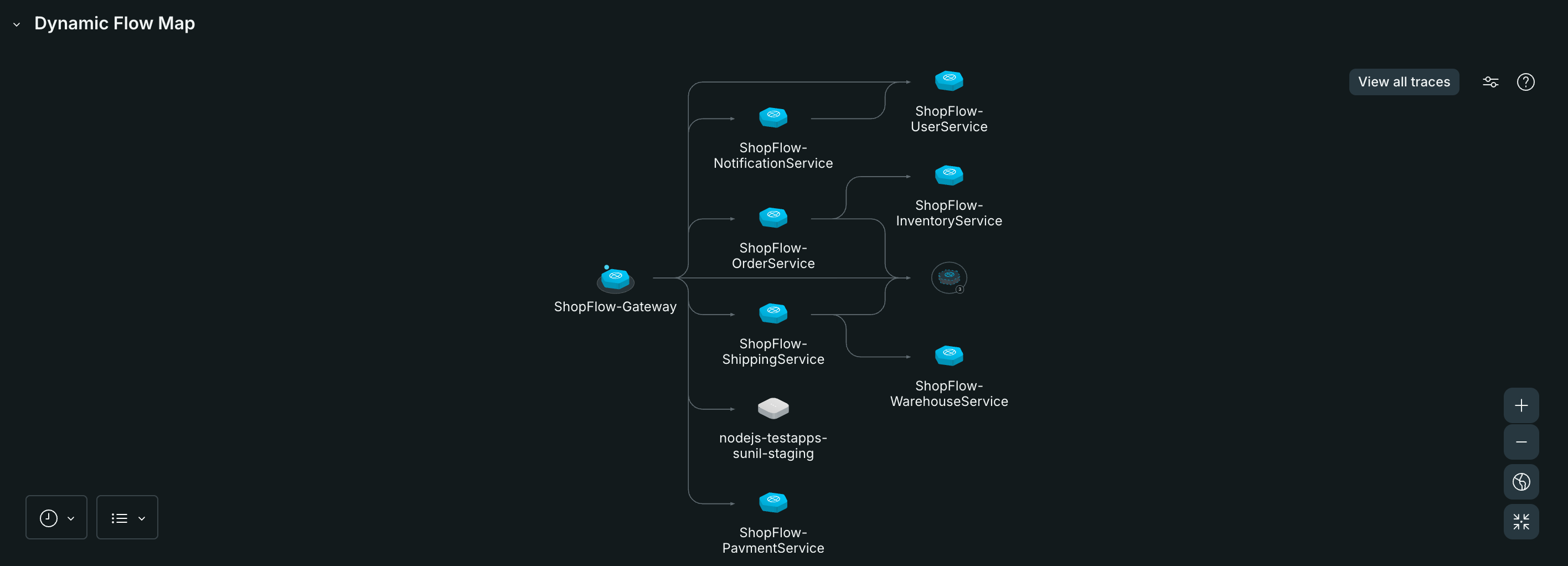
Screenshot of the Dynamic Flow Map showing service dependencies for a transaction flow

Throughput

  • Displays request volume for your focal transaction over the selected time range. For more details, see Throughput documentation.

Errors

  • Displays error count for your focal transaction over the selected time range. For more details, see Errors documentation.

Why these matter: These charts are automatically scoped to your focal transaction, giving you immediate visibility into the health of your specific business workflow without needing to filter through all entity data.

5. Participating entities

The bottom section shows performance metrics for all entities participating in your transaction:

Response Time (Top 20 services scoped to transaction)

  • What it shows: Latency for up to 20 services handling your transaction
  • Multiple lines: Each colored line represents a different service
  • Use case: Identify which services are slowest and contributing to overall latency

Throughput (Top 20 services scoped to transaction)

  • What it shows: Request volume handled by each service
  • Use case: See which services handle the most requests in your transaction flow

Error Rate (Top 20 services scoped to transaction)

  • What it shows: Error rates for each participating service
  • Use case: Pinpoint which services are generating errors

Why this matters: While golden metrics show the focal transaction's performance, participating entities charts reveal which specific services in your distributed system are causing issues. This helps you quickly drill down to the root cause during troubleshooting.

Understanding gaps in service maps

You may notice gaps or disconnected services in your service dependency visualizations. Here's what causes them and what you can do:

Common causes of gaps:

  • Low sampling rate: If trace sampling is too low for certain service connections, New Relic may not have enough trace data for that edge during your query window to display those relationships.

    • What you can do: Check your agent's latest version and sampling configuration to take advantage of enhanced sampling capabilities.
  • Missing telemetry: A service in the middle of the trace may be participating in the trace correctly but failing to send span data to New Relic.

    • What you can do:
      • Verify the service is properly instrumented and configured to send data to New Relic
      • Check network connectivity and firewall rules
      • Review agent logs for errors
    • When you can't fix it: Some service types or instrumentations (like certain AWS entity types) may not support sending span data. In these cases, gaps are expected and cannot be resolved.

Disconnected services:

When a service in the middle of your trace fails to send data, you may see downstream services appear in your workload but disconnected from your focal entity. These disconnected services:

  • Show up because they successfully send trace data to New Relic
  • Appear isolated because their parent service is missing from the trace
  • May have their own connected child services forming separate fragments

Tip

If you see persistent gaps or disconnected services, start by checking the sampling configuration and instrumentation health of the missing services. Focus on services that appear between your focal entity and the disconnected fragments.

Errors

The Errors page provides a centralized view of all errors occurring across your workload. For more on New Relic error tracking, see Errors inbox documentation.

When your workload health degrades, check the Errors page first to see if error rates spiked and which services are affected.

Performance risks

The Performance risks page shows performance risks detected across the entities participating in your workload, so you don't have to check each entity individually. For more on performance risks, see Performance Risks inbox documentation.

Screenshot showing the Performance risks page for a workload

Monitor section

The Monitor section provides different lenses to view your workload data.

Transaction360

Transaction360 visualizes the complete distributed trace for your focal transaction. For more on Transaction360, see Transaction360 documentation.

When troubleshooting slow transactions or errors, use Transaction360 to see exactly which service calls are slow or failing.

KPIs page

The KPIs page provides a centralized view of all your workload KPIs with detailed charts and management options.

Access the KPIs page from the left sidebar under MONITOR > KPIs.

What you'll see

The KPIs page displays:

  • Search bar: Quickly find specific KPIs by name
  • Category grouping: KPIs organized by their assigned category (e.g., "Uncategorized KPIs")
  • Detailed KPI charts: Each KPI shows:
    • KPI name
    • Full-size time series chart with hover tooltips
    • Current values and trends over your selected time range
    • Actions menu (...) for editing, hiding, or creating alerts

Key features

  • View all KPIs: See your complete KPI catalog in one place, including both visible and hidden KPIs
  • Search and filter: Use the search bar to quickly locate specific KPIs
  • Detailed visualization: Larger charts compared to the summary page tiles provide better analysis
  • Quick actions: Access edit, hide, and alert creation options from each KPI's menu

When to use this page

Use the KPIs page when you need to:

  • Review all your workload KPIs in detail
  • Compare multiple KPIs side-by-side
  • Analyze KPI trends with larger, more detailed charts
  • Manage which KPIs appear on your summary page

Learn more about creating and managing KPIs →

Entity details

The Entity details page lists all entities participating in your workload. For more on entities, see Learn about entities.

When you know there's a problem but aren't sure which service is causing it, scan the Entity details page to find unhealthy entities.

Activity

The Activity page provides comprehensive monitoring and analysis of your workload's performance, combining entity metrics, transaction insights, and infrastructure health in one view.

Access the Activity page from the left sidebar under MONITOR > Activity.

What you'll see

The Activity page is organized into several key sections:

1. Link dashboards Connect relevant dashboards to your workload for quick access to related visualizations.

2. Workload entity metrics Visual performance charts grouped by entity type (e.g., Services - APM):

  • Throughput: Request volume across all workload services over time
  • Error rate: Error percentages for each service with trend lines
  • Latency: Response times showing performance variations across services

Each chart displays multiple colored lines representing different services, making it easy to spot outliers or performance degradation.

3. Participating transactions A detailed table showing transaction-level performance with comparative analysis:

  • Transaction name: The specific transaction being monitored
  • Entity name: The service handling the transaction
  • Slowest time: Maximum execution time for the transaction
  • Error rate: Percentage of failed requests
  • Average duration: Mean execution time
  • %change columns: Percentage changes compared to the previous time period (green for improvements, red for regressions)

The table also includes:

  • Pilot indicator: Visual markers for transaction types
  • Position arrows: Shows transaction flow direction (→ or ←→)
  • Sortable columns: Click column headers to sort by any metric

4. Infrastructure summary Quick overview at the bottom showing:

  • Number of active alerts
  • Recent changes (deployments, configuration updates)
  • Error counts

When to use this page

Use the Activity page when you need to:

  • Compare service performance: See which services are performing well or struggling
  • Identify performance regressions: Quickly spot negative percentage changes in key metrics
  • Investigate transaction issues: Drill into specific transactions causing problems
  • Correlate events: Connect performance changes to deployments, alerts, or infrastructure issues
  • Monitor trends: Track how metrics evolve over your selected time range

Key features

  • Switch to investigation mode: Toggle detailed analysis mode for deeper insights
  • Facet data: Filter and group metrics by different dimensions
  • Time comparison: Automatically compares current metrics to previous periods
  • Multi-service visualization: See all workload services on the same charts for easy comparison
  • Alerting context: Understand how many critical alerts are active in your workload

The Activity page serves as a central hub for performance investigation, combining high-level trends with transaction-specific details to help you quickly identify and diagnose issues.

Maps

The Maps page visualizes service dependencies within your workload. For more on service maps, see Service maps documentation.

When diagnosing cascading failures or understanding complex dependencies, use the Maps view to see how services interact within your workload.

Change tracking

The Change tracking page logs deployments and configuration changes impacting your workload. For more on change tracking, see Change tracking documentation.

When performance degrades, check Change tracking to see if recent deployments or config changes might be the cause.

Reports section

The Reports section provides performance tracking and compliance views.

Service levels

The Service levels page lets you define and monitor SLOs and SLIs for your workload. For more on service levels, see Service levels documentation.

Settings section

The Settings section lets you configure workload behavior.

Configure health status

Set up health roll-up rules for your workload. For more on configuring health status, see Workload status configuration.

If you notice missing connections or disconnected service nodes, see Troubleshooting Workloads to check agent trace sampling and instrumentation requirements.

Important

You cannot change the focal transaction after creating Intelligent Workloads. To monitor a different transaction, create a new workload.

Next steps

Copyright © 2026 New Relic Inc.

This site is protected by reCAPTCHA and the Google Privacy Policy and Terms of Service apply.