preview
We're still working on this feature, but we'd love for you to try it out!
This feature is currently provided as part of a preview program pursuant to our pre-release policies.
Modern Kubernetes environments have evolved into complex, multi-cluster fleets, but traditional observability tools often provide only a fractured, siloed view of individual clusters. This Kubernetes cross-cluster UI provides a unified command center that transforms this multi-cluster complexity into fleet-wide clarity.
This unified view helps Platform Engineers and SREs to:
- Unify fleet-wide observability on a single dashboard that's compatible with clusters monitored by New Relic agents or OpenTelemetry.
- Accelerate root cause analysis with a guided triage workflow.
- Reduce costs by identifying wasted resources across the entire fleet.
- Empower developers with an application-centric view for self-service.

Access the new UI
You can access the new Kubernetes cross-cluster UI from the Kubernetes option in the left navigation in the New Relic platform.
To access the Kubernetes cross-cluster UI:
Go to one.newrelic.com > All capabilities > Kubernetes
Click the Try it out button at the top right corner of the page.
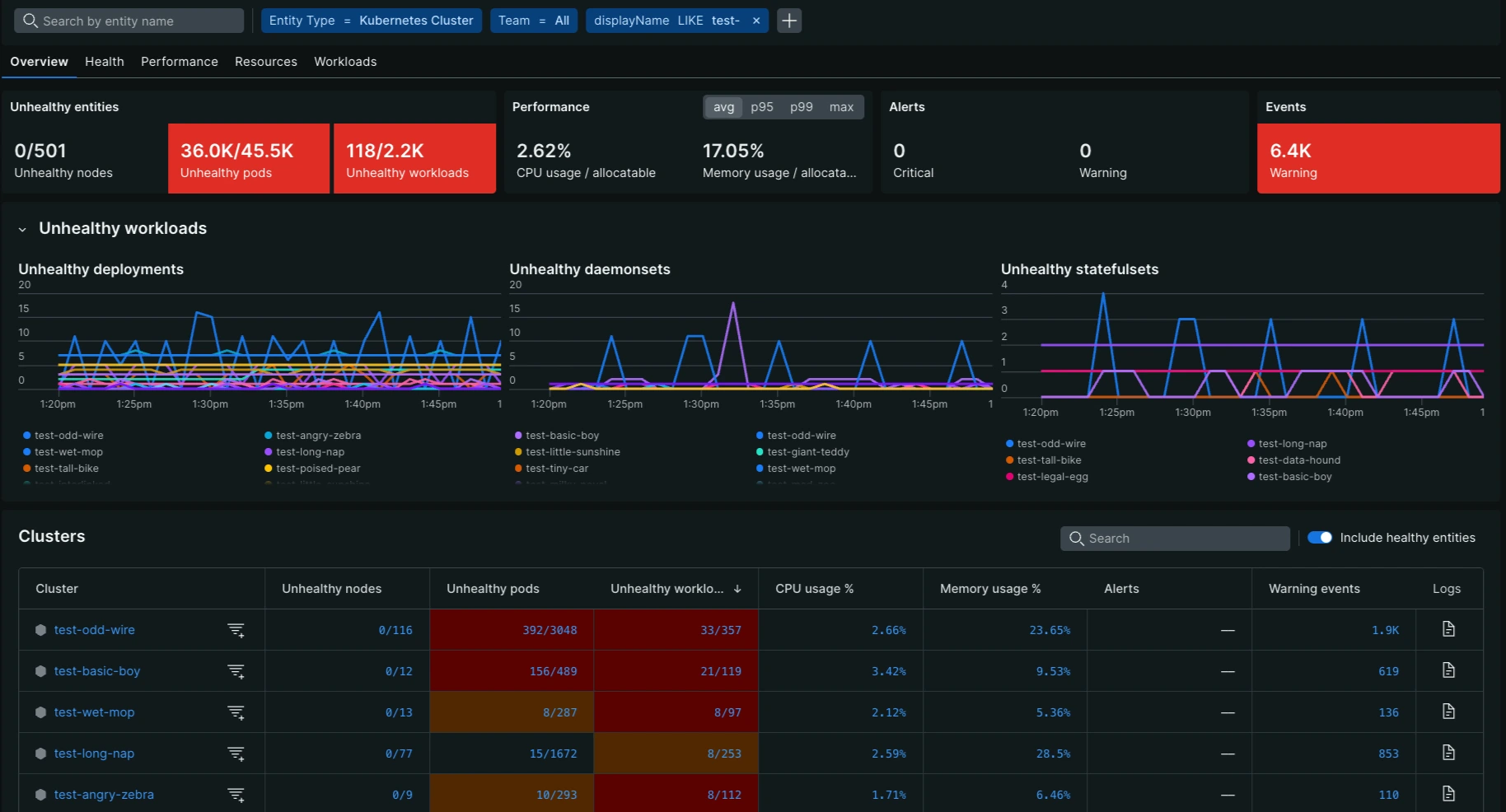
The Kubernetes cross-cluster UI is structured to provide both a high-level overview and deep-dive capabilities into your entire Kubernetes fleet. The main components of the UI include:
- Feedback button: Lets you easily share feedback on your experience with the UI.
- Entity filters: Filter and triage issues using tags and values at the cluster or node level.
- Cluster filter: Filter to isolate the UI to a single or smaller set of Kubernetes clusters.
- Colored scorecards: Display relevant high-level metrics to surface the most important issues that need attention across the entire fleet.
- Clicking a scorecard orders the table in the context of that metric, surfacing the clusters and nodes with the most critical issues at the top.
- It also enables a line chart to visualize the metric's evolution over the selected time range.
- Line chart: Provides the evolution of the metric over the selected time frame for trend analysis.
- Table: Lists all entities in the fleet and provides detailed metric data for each cluster under the five main tabs.
- Health focus: The table provides a filter to only list "unhealthy" entities to focus your attention where it is really needed.
- Search: A text search bar allows you to filter table rows based on free text entered.
- Color-coding: Like the scorecards, table cells are color-coded (Yellow, Red) to quickly draw attention to entities with issues that meet a specific severity threshold.
Drill-down capabilities for triage
The cross-cluster UI is specifically designed to accelerate root cause analysis with a guided triage workflow. The primary mechanism for this deep investigation is the ability to drill down from a fleet-wide metric to a single cluster's view:
- From scorecard to cluster ranking: When you click a colored scorecard (e.g., Unhealthy Pods), the clusters table immediately re-sorts. This places the clusters with the worst performance for that specific metric at the top, enabling you to identify where the issue is most critical across your entire fleet.
- From table metric to Kubernetes navigator: Click a metric value within any cell of the table for a specific cluster or node to automatically launch the Kubernetes navigator. The navigator's view is automatically predefined/filtered for that specific cluster and metric of interest, allowing you to continue your investigation with a deep dive.
Tab-specific metrics
The UI is organized into five main tabs:
Each tab provides specific metrics both at the aggregate (Scorecard) and cluster/node (Metric) level, along with their associated color-coded thresholds for quick triage.