The New Relic Query Language (NRQL) is a powerful tool you can use to query and understand nearly any type of data, but it can seem overwhelming at first glance. Don't worry! Here's some information to give you a foundational understanding of NRQL, including what it is, how to use it, and some tips and tricks that will help you get the most out of your queries. Once you've learned about NRQL, you can capture and interpret your data, letting you break down the big picture into easily understandable pieces and helping you identify problems as they occur.
Here's a quick video to help introduce you to using NRQL by showing you how to find a query from a dashboard and modify it in the query builder. For more detailed information on querying, including a listing of clauses, functions, and example queries, see our NRQL reference.
What is NRQL?
NRQL is an acronym of New Relic query language. It's a query language similar to ANSI SQL (see the syntax), and you can use it to retrieve detailed New Relic data to get insight into your applications, hosts, and business-important activity. NRQL can help you:
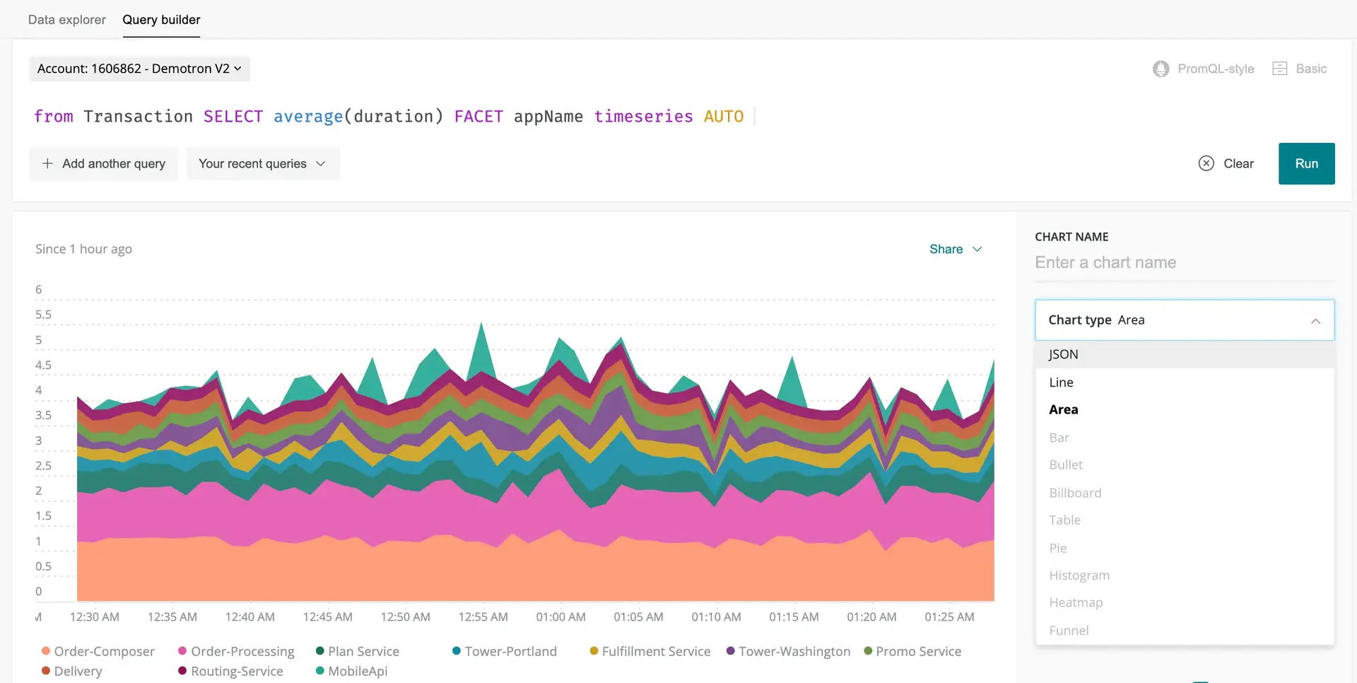
- Create a new chart
- Answer a specific question for the purpose of troubleshooting or business analysis
- Set up NRQL-based alerts (our primary and most powerful type of alert)
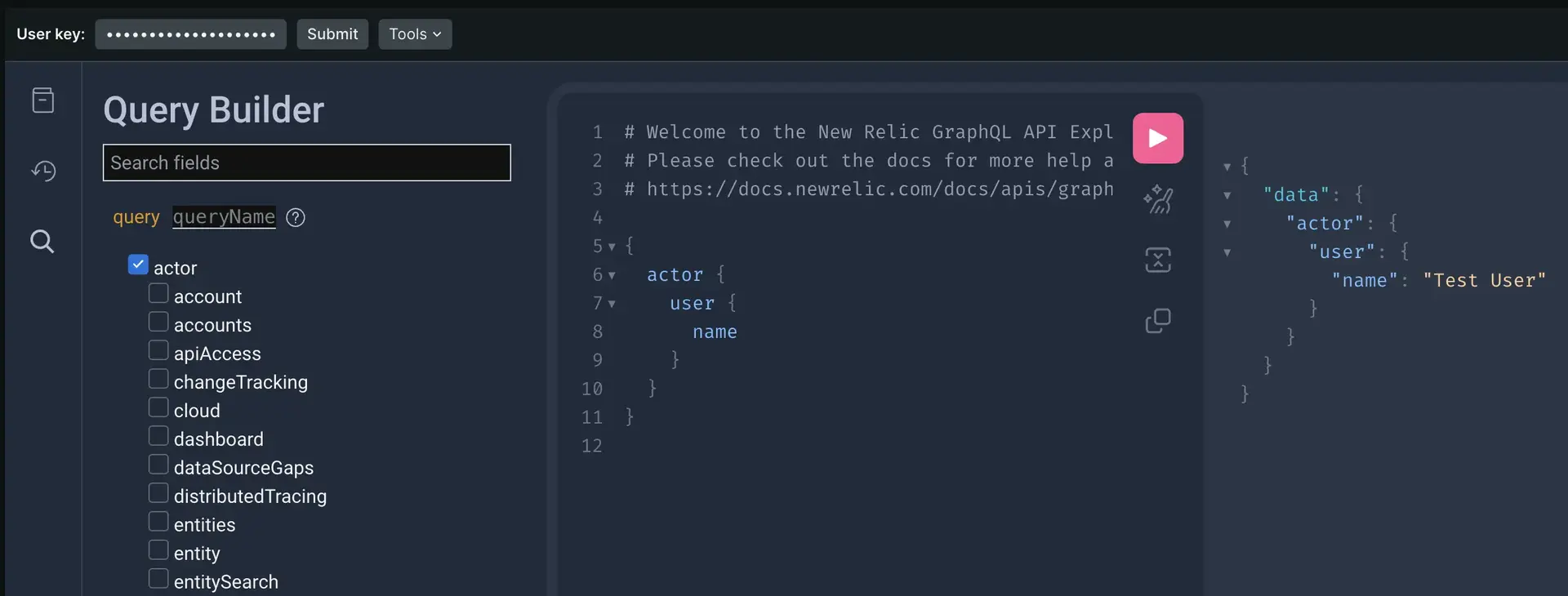
- Make API queries of New Relic data (for example, using our NerdGraph API)
You can use NRQL to create simple queries, such as fetching rows of data in a raw tabular form that gives insight on individual events. You can also use NRQL to run powerful calculations on the data before it's presented to you, such as crafting funnels based on how end users interact with your site or application.
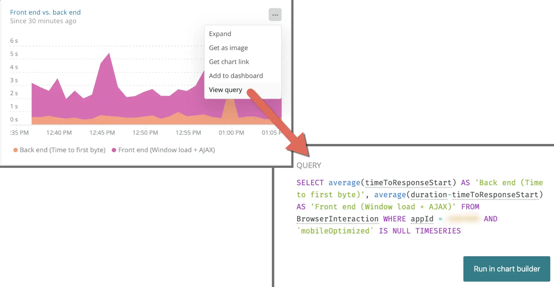
We use NRQL behind the scenes to generate many of the charts and dashboards in our curated UI experiences:

We build many of the charts and visualizations within New Relic using NRQL. You can view a chart's query and then edit it to make your own custom chart as a quick way to get started using NRQL.
Where can you use NRQL?
You can use NRQL across the platform to access your data. Those places include:
Tip
NRQL is one of several ways to query New Relic data. For more on all query options, see Query your data.
How is NRQL structured?
If you're already familiar with writing SQL queries, you'll be happy to know that NRQL has a lot of similarities. Here's a quick breakdown of the structure of a NRQL query:
SELECT function(attribute) [AS 'label'][, ...]
FROM data type
[WHERE attribute [comparison] [AND|OR ...]][AS 'label'][, ...]
[FACET attribute | function(attribute)]
[LIMIT number]
[SINCE time]
[UNTIL time]
[WITH TIMEZONE timezone]
[COMPARE WITH time]
[TIMESERIES time]Here are the rules that NRQL follows:
NRQL rule | Details |
|---|---|
Required values | The |
Query string size | The query string must be less than 4 KB. |
Case sensitivity |
|
Syntax for strings | NRQL uses single quotes to designate strings. For example: |
Non-standard custom event and attribute names | Events that we report by default have names that contain alphanumeric characters, colons ( |
Data type coercion | We don't support data type "coercion." For more information, see Data type conversion. |
If you need any more information, you can check out our NRQL reference to help you build your queries.
What data can you query with NRQL?
NRQL lets you query nearly every type of our telemetry data, including:
- Event data from all New Relic products. Examples include:
- APM events, like
Transaction - Browser monitoring events, like
PageView - Mobile monitoring events, like
Mobile - Infrastructure events, like
ProcessSample - Synthetic events, like
SyntheticCheck - Custom events, like those reported by the Event API
- APM events, like
- Metric timeslice data (metrics reported by APM)
- The
Metricdata type (metrics reported by the Metric API and data sources that use that API) - The
Spandata type (distributed tracing data) - The
Logdata type (data from our log management capabilities)
Tip
Some data, like relationships between monitored entities, is not available via NRQL but is available using our NerdGraph API.
Ready to learn more? We have information on how to use NRQL and how to use charts and dashboards with NRQL. If you want to start using NRQL instead, jump straight into our guided NRQL tutorial.


