Objectives
By the end of this tutorial, you will:
- Identify slow database queries
- Understand how to resolve slow database queries
- Understand how to use the database UI
Why optimize on database queries
When your app is disrupted, your customers are left waiting while you troubleshoot a problem that's as complex as your system. Your data's reporting and you have a rough idea of what could be the problem, but where do you start?
If your site relies on a database (and it probably does), you'll want to check that query response time is performing as expected. Often, the performance of your site depends on how well your database handles queries sent by your customers. With New Relic, you can use our database UI to track database performance over time, letting you pinpoint when a problem occurred so you can figure out what kind of solution you need.
This tutorial explains how to troubleshoot slow queries in your database operations.
Scope out the problem with your app data
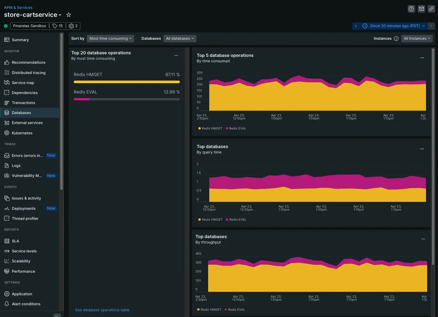
Our database UI displays charts built with NRQL queries. These charts use data from the apm.service.datastore.operation.duration metric reported by the agent you installed. These charts show the response time of your top database processes by the top operations, their query time, and your app's throughput.
When you're scoping out a problem, we recommend using each of these different entry points as they tell different parts of the same story. Let's walk through how you might use the UI to begin diagnosing performance issues.

To begin troubleshooting your slowest queries, you'll start on APM's default database UI.
Navigate to the databases UI: Go to one.newrelic.com > (select an app) > monitor > databases
Time consumed by database operations
The Most time consuming chart shows the total processing time on queries by a database operation.
This chart that displays five database operations, then tracks their time to execute a query. This chart shows your busiest, most frequently called queries at the top. If an infrequently called query trends with your busiest queries it may indicate a problem with a query that needs further scoping to understand why it consumes so much processing time.
Top databases by query time
The Top databases by query time chart shows how your databases are performing based on how long it takes to execute a query.
This NRQL query creates a chart that displays top databases, then averages how long queries take. For example, if, on average, your Redis EVAL database averages about a half-second to process a query, but query time increased by two seconds, then you know to dig deeper into individual queries.
Top databases by throughput
The Top databases by throughput chart shows your database throughput over time.
Digging deeper into your database queries
Digging deeper means following the data. Identifying the approximate area where a problem exists is only part of finding a solution.
After looking at how your database performs on average, your next step is to follow the data with query time, transactions, and stack traces.


