Anomaly detection gives your team flexible, adaptive monitoring for unusual behavior in your systems. Instead of relying on fixed thresholds, it learns your data's normal patterns and adjusts automatically, reducing false alarms and alert fatigue. You can tune sensitivity, add custom context to alert notifications, and let New Relic learn your baseline trends automatically, or set your own.
Quick start guide
- When to use anomaly detection
- How anomaly detection works
- Configure thresholds
- Seasonality settings
- Anomaly direction
- Understand when alerts fire
- Multi-signal conditions
- Tune thresholds using signal data
- Troubleshoot common problems
When to use anomaly detection vs. static thresholds
Static thresholds are pinned to fixed numbers. Anomaly detection evaluates the expected mathematical behavior of a signal over time. Use this table to pick the right model for your metric:
| Scenario | Recommended type | Why |
|---|---|---|
| Natural or seasonal patterns (business hours, weekly cycles, seasonal shopping peaks) | Anomaly | Learns cyclical baselines so scheduled peaks don't trigger alert storms |
| Dynamic systems where "normal" changes over time | Anomaly | Adapts automatically as your system grows, no manual re-tuning |
| Brand-new or highly volatile metrics | Static (temporarily) | Anomaly detection needs 1-4 weeks of history to build a stable baseline, and volatile metrics can produce bands too wide to be useful |
| Hard capacity limits (disk space, memory, connection limits) | Static | Critical physical limits need immediate action regardless of past pattern trends |
| SLA or compliance targets (for example, response time < 2 seconds) | Static | Best when you must guarantee a fixed performance bound |
| Binary states (service up/down, payment failures) | Static | These aren't patterns — any failure matters |
How anomaly detection works
New Relic evaluates historical trends to build a predicted baseline and an acceptable variation zone (the gray band) around it:
- Learning phase: New Relic watches your data for 1-4 weeks and learns patterns such as "Mondays are always busy" or "traffic drops at 6 PM."
- Prediction: The system predicts what your next data point should be, based on historical patterns.
- Variation zone (gray band): A band of acceptable variation surrounds the prediction. Think of it like a road with guardrails — staying within the guardrails is normal.
- Alert trigger: An alert fires only when your actual data goes outside the variation zone and stays there for your specified duration.
New Relic also adjusts these predictions automatically:
- Data consistency: Metrics that stay in a tight, predictable range get narrower bands. Noisy or unpredictable metrics get wider bands, to avoid false alarms.
- Cyclical fluctuations: The algorithm looks for recurring, shorter-than-one-week patterns (like a Wednesday 1pm deploy or nightly batch jobs) and adjusts predictions to match.
- Age of data: New Relic calculates predictions using 1-4 weeks of history, depending on data availability (queries using the
FACETclause aren't trained on stored data and start learning from scratch). The less history a signal has, the more its baseline will fluctuate. Accuracy improves as more data accumulates, and New Relic gives more weight to recent data.
Configure thresholds
Anomaly sensitivity thresholds control how easily your alerts trigger. Higher sensitivity catches smaller changes but may create more false alarms. Lower sensitivity only alerts on bigger problems but might miss subtle issues.
Understand the anomaly detection chart
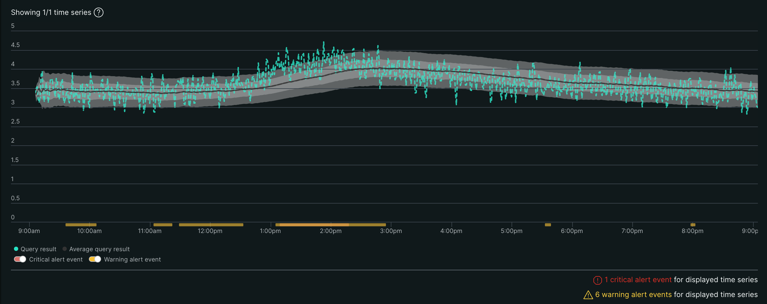
| Chart element | What it shows |
|---|---|
| 1. Green line (Signal) | Your actual data from your NRQL query — what's really happening |
| 2. Black dotted line (Baseline) | New Relic's prediction based on historical patterns |
| 3. Light gray band (inner) | Critical threshold — the tighter the band, the more sensitive it is |
| 4. Dark gray band (outer) | Warning threshold (optional) — the wider the band, the less sensitive it is |
| 5. Red areas | Alert events — your signal was outside the gray band for the specified duration |
Chart behavior settings:
- Aggregation window: Increasing this makes the baseline steadier and reduces signal variation. Decreasing it results in a more spiky signal.
- Window duration: Higher durations create a smoother signal line. Lower durations result in a spikier, more responsive signal.
Sensitivity control: Tighter vs. looser bands
This directly controls how many alerts you get:
- Tighter bands (smaller gray area): Closer to the baseline = more alert events, because your data has less room for normal variation.
- Looser bands (larger gray area): Further from the baseline = fewer alert events, because your data can vary more before triggering alerts.
Example: If your CPU normally runs at 50%:
- Tighter band: Alerts when CPU hits 55% (more sensitive)
- Looser band: Alerts when CPU hits 70% (less sensitive)
You can create anomaly sensitivity thresholds from an alert condition. Some tips for setting anomaly thresholds:
- Set the seasonality to specify a known seasonality pattern.
- Set the anomaly direction to monitor alert events that happen either above or below the anomaly.
- Use the slider bar to adjust the Critical sensitivity threshold, represented in the preview chart by the light gray area around the signal. The tighter the band around the signal, the more sensitive it is and the more alert events it will generate.
- Optionally, add a Warning threshold (the darker gray area around the signal) to get early notifications before problems become critical. This gives you time to investigate issues before they trigger the main alert.
Follow these steps to create an anomaly detection alert condition:
Go to one.newrelic.com > All capabilities > Alerts > Alert Conditions.
Click + New alert condition > Use guided mode (or the more advanced Query mode).
Go through the guided steps until you get to Set thresholds.
Select Anomaly.
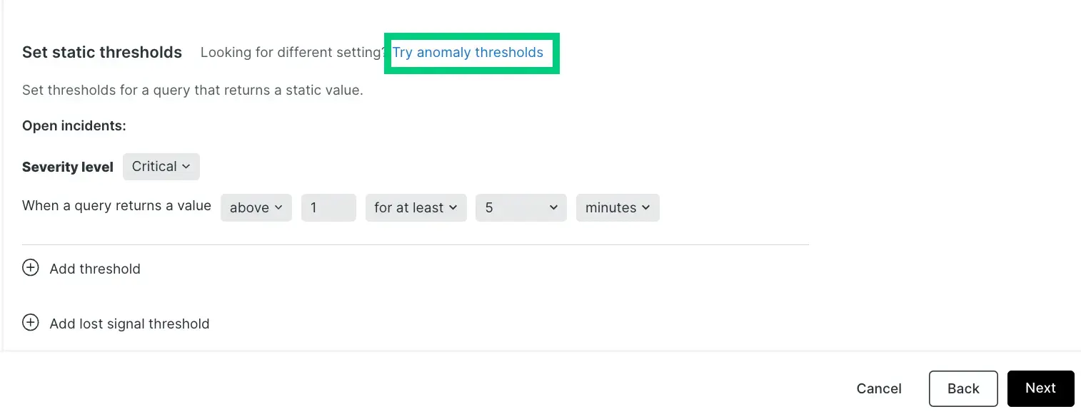
From the Calculate seasonality dropdown, choose how often your data patterns repeat. For more details, see Seasonality.
From the Threshold direction dropdown, choose when to trigger alerts. For more details, see Anomaly direction.
Open alert events with a severity level. Choose from the dropdown:
- Critical: For urgent issues requiring immediate attention (dark gray band)
- Warning: For less urgent issues that need monitoring (light gray band, optional)
An anomaly alert triggers when the signal (green line) moves away from the baseline (black dotted line) by a specified number of standard deviations. The gray band area represents your threshold range.
Important
Critical concept: The signal must stay in violation for your specified duration before creating an alert event — a brief spike that self-corrects won't trigger one. See Understand when alerts fire for the full timeline of how an alert opens and closes.
Configure your threshold settings:
Choose timing rules:
- For at least - Signal must stay outside the band for the full time period before alerting. Reduces false alarms.
- At least once in - Alert when signal goes outside the band within the time window. Faster detection.
Set violation duration: Choose from the dropdown how long (in minutes) the signal must remain outside the threshold:
- Shorter duration = More alert events (even brief violations trigger alerts)
- Longer duration = Fewer alert events (only sustained violations trigger alerts)
Set sensitivity level (standard deviations): Use the slider to control band tightness:
- Tighter band (toward "more alert events") = Signal has less room for deviation, more alerts
- Looser band (toward "fewer alert events") = Signal has more room for deviation, fewer alerts
You can add one more threshold by clicking + Add threshold to create both warning and critical levels with different sensitivity settings.
Add the details of the alert condition and click Save condition.
Seasonality settings
Seasonality helps anomaly detection distinguish between expected changes (like higher traffic during business hours or weekend slowdowns) and real problems (like system outages).
| Your pattern | Choose |
|---|---|
| Not sure, mixed, or a complex environment (microservices, global apps) | New Relic calculation (recommended) |
| Metric should stay flat — any spike is a problem (errors, security events) | None |
| Business-hours activity (internal tools, corporate apps) | Daily |
| Busy weekdays, quiet weekends (B2B apps, office-based services) | Weekly |
| Regular scheduled jobs (hourly batch processing) | Hourly |
Anomaly direction
You can choose whether you want the condition to look for behavior that goes above the predicted value ("upper"), below the predicted value ("lower"), or either. You choose this with the prediction direction selector, for any condition — single-signal or multi-signal.
Example use cases for this:
- You might use the Upper setting for a data source like error rate, because you generally are only concerned if it goes up, and aren't concerned if it goes down.
- You might use the Lower setting for a data source like throughput, because sudden upward fluctuations are quite common, but a large sudden downswing would indicate a problem.
Here are examples of how large fluctuations in your data would be treated under the different anomaly direction settings. The red areas represent alert events.

Understand when alerts fire
Anomaly detection alerts don't fire the moment your data touches the gray threshold band. The timing depends on your duration settings and how long the violation persists.
Here's what many customers experience:
Customer expectation: "My CPU spiked to 90% and went outside the gray area, so why didn't I get an alert?"
Reality: If your spike lasts only 2 minutes but your duration is set to 5 minutes, no alert will be created — even though the data clearly went outside the gray bands.
Tip
Common misconception: Duration controls how long a problem must persist before alerting, not how quickly you'll be notified. Setting duration to 5 minutes doesn't mean "notify me within 5 minutes" — it means "only notify me if the anomaly lasts 5 minutes." A lower duration means alerts fire sooner, but you may see more false alarms.
Multi-signal conditions
Depending on how you defined your NRQL query when creating the alert condition, it may be monitoring many signals, not just one. When working with NRQL, these queries use the FACET clause. Keep these things in mind:
- Signal limit: A single anomaly alert condition can monitor up to 20,000 individual signals.
- Independent evaluation: Each signal is tracked and evaluated against its own historical baseline. An anomaly on one signal triggers an incident without another signal's normal behavior skewing or masking it.
- Uniform settings: The threshold settings you specify apply the same to all signals being monitored by this condition, even though baselines are calculated per signal.
- Chart preview: We show a maximum of 500 signals on the preview chart. We don't show the predicted signal and threshold bands when there's more than one signal on the chart — select a single time series from the legend to isolate its baseline and threshold bounds.
Tune thresholds using signal data
Once a condition has been evaluating data for a few days or more, don't guess at a threshold. Every anomaly condition evaluation publishes an NrAiSignal event containing the actual value, the predicted value, and the standard deviation of the prediction error (numberOfDeviations). Query these events to see exactly how your threshold performs, and to chart your signal and predictions over longer time windows than the condition editor's preview chart allows.
Tip
Each query on this page needs your condition's ID. Find it in the alert condition's URL in the New Relic UI (the number after /conditions/), or run FROM NrAiSignal SELECT uniques(conditionId) SINCE 1 week ago to list the condition IDs reporting data on your account.
Important
These queries filter by conditionId only. For a multi-signal condition, that blends every signal's deviations together instead of isolating one, so the results won't tell you much about any single signal. To analyze one signal within a faceted condition, you'll need to also filter or facet these queries by that signal's identifying attribute.
Find your typical range of deviations
A histogram of numberOfDeviations over a week or more shows the typical range of deviations for your signal, which helps you pick a starting threshold:
FROM NrAiSignal SELECT histogram(numberOfDeviations, start: -10, width: 20, buckets: 40) WHERE conditionId = YOUR_CONDITION_ID SINCE 1 week ago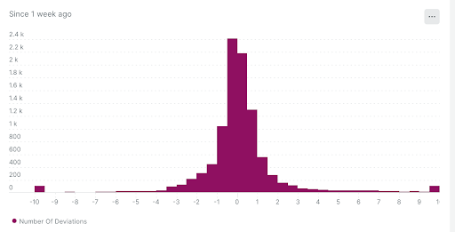
Compare deviations against a candidate threshold over time
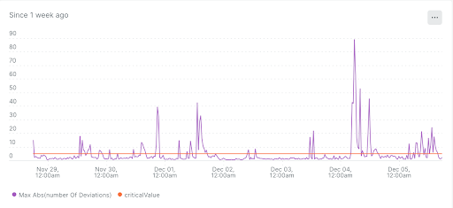
Plot the same deviations as a time series next to a candidate threshold line, to see how often, and by how much, your signal would have violated it:
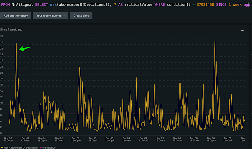
FROM NrAiSignal SELECT max(abs(numberOfDeviations)), 5 AS criticalValue WHERE conditionId = YOUR_CONDITION_ID SINCE 1 week ago TIMESERIES 28 minutesReplace 5 with your candidate threshold. Set the TIMESERIES window to a multiple of the condition's aggregation window, and avoid TIMESERIES MAX for this comparison.
Calculate average and percentile deviation
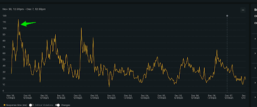
For a more holistic view, calculate the average and percentile standard deviation over a longer window. For example, this latency signal has a spike to about 120 ms:
At that same point in time, the standard deviation is about 30.43:
Run this query to compare the average and percentile standard deviation against your current threshold:
SELECT average(deviations) AS 'avg', percentile(deviations, 75) AS 'p75', percentile(deviations, 95) AS 'p95' FROM (FROM NrAiSignal SELECT max(abs(numberOfDeviations)) AS 'deviations' WHERE conditionId = YOUR_CONDITION_ID TIMESERIES 1 hour LIMIT MAX) SINCE 1 week ago COMPARE WITH 2 weeks ago FACET string(7) AS 'Current Threshold'
In this example, a threshold between 10 and 17 would be a better fit than the current threshold of 7.
Check model behavior
Plot the actual signal, the predicted value, and the calculated threshold together to see whether the model is well-trained and the threshold is well-calibrated:
FROM NrAiSignal SELECT latest(signalValue), latest(predictedValue), latest(predictedValue + (standardDeviation * {condition_threshold})) AS 'Upper Threshold' WHERE conditionId = {condition_id} SINCE 1 week ago TIMESERIES 30 minutes- signalValue: The actual value from the condition's signal.
- predictedValue: The model's calculated baseline, which shifts over time as it learns weekly and historical trends.
- Upper/lower threshold: The high or low boundary calculated from the condition's standard deviation threshold.
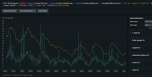
This trend shows a well-tuned condition:
- The signal isn't consistently above the upper threshold, so the standard deviation threshold is likely set correctly.
- The predicted value tracks the actual signal fairly closely, so the model is well-trained.
Use this to diagnose problems:
- If the signal is consistently above the upper threshold, or below the lower threshold, the standard deviation threshold needs adjusting.
- If the predicted value trend varies a lot from the actual signal, the model needs more time to learn. Give it more data before you tune further.
Tip
For a lower threshold, replace the upper threshold term with predictedValue - (standardDeviation * {condition_threshold}). For a two-sided threshold, include both terms in the same query to plot upper and lower threshold lines together.