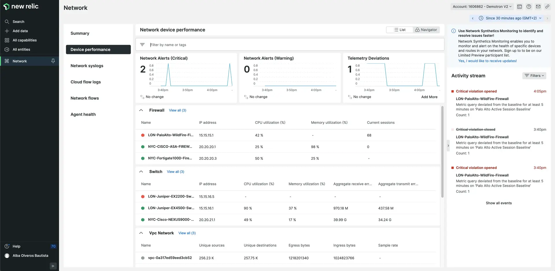
The SideBySide component lets you split the screen in half, or more sections. A common use case is to show a screenshot in the right column, and accompanying text on the left.
You need to wrap the content for each side inside a Side component, but you can add as much content as you need inside each Side.
Technically the component supports more than two Side columns, but you should avoid using more than two.
Here's an example of the component:

Go to one.newrelic.com > All capabilities > Network
This is some awesome content from the amazing documentation team.
Create a SideBySide component
Here's a template of a SideBySide component:
<SideBySide> <Side> <img alt="Example" src="/images/example-image.webp" /> </Side>
<Side>This is some awesome content from the amazing documentation team.</Side></SideBySide>;ヒント
The Keyboard Maestro macro for the SideBySide is kkside.