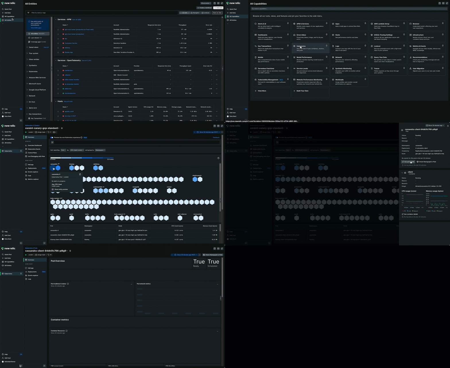
The New Relic Kubernetes cluster explorer uses the data collected by the Kubernetes integration to show the status of your cluster, from the control plane to nodes and pods.
After installing our Kubernetes integration, you can start instrumenting the services that run in your cluster. To learn more about how to do this, please check our Monitor services running on Kubernetes page.
You can find out about the health of each entity, explore logs, and see how your apps are performing. With the Events integration, everything that happens in your cluster becomes visible, and logs brought in using the logs plugin are also available.
Meet the Kubernetes Navigator
The Kubernetes Navigator UI is a Kubernetes version of our New Relic Navigator. It enables users to easily group entities and isolate high resource consumption, capacity issues, and alert status for Pods, Deployments, DaemonSets, Job, CronJob, StatefulSets, Nodes, and Container.
The Navigator supports visualizing the following Kubernetes entity types:
Entity Type | Metrics | Group By |
|---|---|---|
Pod | Pod Status, CPU Utilization (limit), CPU Utilization (request), CPU Used (cores), Memory Utilization (limit), Memory Utilization (request), Memory Used (bytes), Container Restarts (delta), Container Restarts (cumulative), CPU Throttled (%), Network Rx (bytes/s), Network Tx (bytes/s), Alert Status, Filesystem Used (%), Warning Events, Start Time, Created At | Namespace, Deployment, StatefulSet, DaemonSet, Job, CronJob, Pod, Node |
Deployment | CPU Utilization (limit), CPU Utilization (request), CPU Used (cores), Memory Utilization (limit), Memory Utilization (request), Memory Used (bytes), Container Restarts (delta), Container Restarts (cumulative), CPU Throttled (%), Network Rx (bytes/s), Network Tx (bytes/s), Pods Missing (#), Pods Missing (%), Alert Status, Created At | Namespace, Deployment |
Statefulset | CPU Utilization (limit), CPU Utilization (request), CPU Used (cores), Memory Utilization (limit), Memory Utilization (request), Memory Used (bytes), Container Restarts (delta), Container Restarts (cumulative), CPU Throttled (%), Network Rx (bytes/s), Network Tx (bytes/s), Pods Missing (#), Pods Missing (%), Alert Status, Created At | Namespace, Statefulset |
Daemonset | CPU Utilization (limit), CPU Utilization (request), CPU Used (cores), Memory Utilization (limit), Memory Utilization (request), Memory Used (bytes), Container Restarts (delta), Container Restarts (cumulative), CPU Throttled (%), Network Rx (bytes/s), Network Tx (bytes/s), Pods Missing (#), Pods Missing (%), Alert Status, Created At | Namespace, Daemonset |
Job | CPU Utilization (limit), CPU Utilization (request), CPU Used (cores), Memory Utilization (limit), Memory Utilization (request), Memory Used (bytes), Container Restarts (delta), Container Restarts (cumulative), CPU Throttled (%), Network Rx (bytes/s), Network Tx (bytes/s), Alert Status, Created At | Namespace, Job |
CronJob | CPU Utilization (limit), CPU Utilization (request), CPU Used (cores), Memory Utilization (limit), Memory Utilization (request), Memory Used (bytes), Container Restarts (delta), Container Restarts (cumulative), CPU Throttled (%), Network Rx (bytes/s), Network Tx (bytes/s), Alert Status, Created At | Namespace, CronJob |
Node | Allocatable CPU Used %, Allocatable Memory Used %, FS Capacity Used %, Pending Pods, Failed Pods, Alert Status | All Nodes, Node |
Container | CPU Utilization (limit), CPU Utilization (request), CPU Used (cores), Memory Utilization (limit), Memory Utilization (request), Memory Used (bytes), Container Restarts (delta), Container Restarts (cumulative), CPU Throttled (%), Alert Status | Namespace, Pod, Deployment, StatefulSet, Daemonset, Job, CronJob, Node, Container |
Use the dropdown filters to select an Entity type, Metric, and Group by. These give you control over the visualization.

Capacity and utilization metrics are colored using a blue gradient which indicates whether a metric value is high (dark blue) or low (light blue/white). The upper and lower bound of the legend dynamically updates based on the metric selected and any filters that have been applied.

When selecting the Alert status metric, entities are colored according to alert incidents that are currently open in the New Relic platform.
Red for critical
Yellow for warning
Green for non-alerting entities
Gray for entities not targeted by an alert condition

Use the filter bar or interact with the grouping headers to apply filters to scope the UI to a specific node, namespace, deployment, or something else.

Hover over an entity to view its alert status and the value of the metric selected in the dropdown. Click to open a panel with more details about the selected entity. These details include tags, golden signals, logs, and access to more detailed entity dashboard pages via the Details links.

Share your feedback
The Kubernetes Navigator UI is a new feature, with additional updates being planned. Please send us your feedback about what you like, dislike, and what other features you'd like to see in this UI.
You can submit feedback directly in New Relic by visiting the Help > Give Us Feedback option in the bottom left nav. To make sure your feedback gets routed to the correct team, please start your feedback text with the words Kubernetes Navigator.

Details on Kubernetes entities
Some resources for learning about Kubernetes-related entities:
- Learn about entities
- For details on how long entities last in New Relic, and other details, see the Kubernetes-related entities in our entity definitions repo.
Cluster Overview dashboard
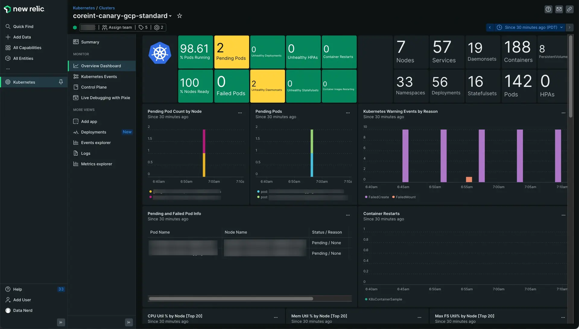
The cluster Overview dashboard can be an essential tool for monitoring and managing your Kubernetes clusters. It provides real-time visibility into the health and performance of the containerized applications running on the cluster, and enables administrators to quickly identify and resolve any issues that may arise.

Go to one.newrelic.com > All capabilities > Kubernetes. Select your cluster and click Overview Dashboard in the left navigation pane. It shows useful overview data about the status and performance of the cluster and its containerized workloads.
It's designed to help answer questions such as:
- Are there any pods that are pending or failed?
- Which Daemonsets, Deployments, Statefulsets, HPAs, or other Kubernetes resources are unhealthy?
- Are all nodes ready and able to host pods?
- How many pods, containers, nodes, or other Kubernetes resources are in the cluster?
- When did a spike in Kubernetes warning events occur?
- When did one or more pods enter a pending state?
- Are there any pods unable to be scheduled to a node?
- Can my nodes host additional pods?
Tip
The cluster Overview dashboard does not currently include information about Jobs or CronJobs.
Browse your Kubernetes events
If you've enabled the Kubernetes events integration, you can click the Kubernetes events in the left pane to browse everything that happened in your cluster, from warnings to normal events. To set it up, select the Kubernetes Events box in step 3 of our install wizard, or follow the instructions.

Go t0o one.newrelic.com > All capabilities > Kubernetes cluster explorer > Events: Browse and filter all your Kubernetes events, and dig into logs and infrastructure data.
Use the cluster explorer
EOL NOTICE
The new Kubernetes Navigator UI is intended to replace the cluster explorer. However, you can enable the original cluster explorer experience at any time by turning off the Kubernetes Navigator toggle switch.
Note that the cluster explorer is not compatible with OpenTelemetry for Kubernetes.

Go to one.newrelic.com > All capabilities > Kubernetes cluster explorer > Summary: Click the toggle to return to the Kubernetes Navigator UI.
The cluster explorer represents your most relevant cluster data on a chart with the shape of a ship's wheel — which is also the Kubernetes logo.
- Outer ring: Contains up to 24 nodes of your cluster, the most relevant based on the amount of alerts. Hover over each node to check resource consumption and the percentage of allocable pods used.

- Inner rings: Contain the pods (
 ) of each node. Pods with active alerts are shown in the third innermost ring, and pods that are pending or unable to run are in the center.

Hover the mouse over each node or pod to get a quick overview of its resource usage. You can click each node and pod to view its resource usage over time or to get more information about its health and active alerts. Colors are based on recommended alert policies: Yellow pods have active warning alerts, while red pods have active critical alerts.

Go to one.newrelic.com > All capabilities > Kubernetes: Click any pod to get more information about its status and health, and to dig deeper into application data and traces, logs, and events.
Click a node to see the following data:
- Pod statistics
- CPU, memory, and storage consumption against allocatable amounts
- Amount of pods used by the node against the allocatable amount of pods
For each pod, depending on the integrations and features you've enabled, you can see:
- Pod status and metadata, including namespace and deployment
- Container status and statistics
- Active alerts (both warning and critical)
- Kubernetes events that happened in that pod
- APM data and traces (if you've linked your APM data)
- A link to the pods' and containers' logs, collected using the Kubernetes plugin for in New Relic
Cluster and control plane statistics are always visible on the left side.
Cluster explorer node table
Below the cluster explorer is the node table, which shows all the nodes of the cluster, namespace, or deployment. Like all other usage indicators, the table shows consumption against allocatable resources.
Search and filter your cluster data
The main way to modify the data view in the cluster explorer is by using the top bar to search for specific attributes or values. All the attributes and values collected by the Kubernetes integration can be combined to narrow down the cluster view.

Go to one.newrelic.com > All capabilities > Kubernetes cluster explorer: All your Kubernetes cluster's attributes and data points can be used to filter the cluster explorer view.
You can also change the time frame using the time picker in the upper right corner. The Auto-refresh box turns the cluster explorer into a real-time dashboard that refreshes every 60 seconds.

Go to one.newrelic.com > All capabilities > Kubernetes cluster explorer: The time picker lets you select several predefined time spans. To reload the data every minute, check the auto-refresh box.