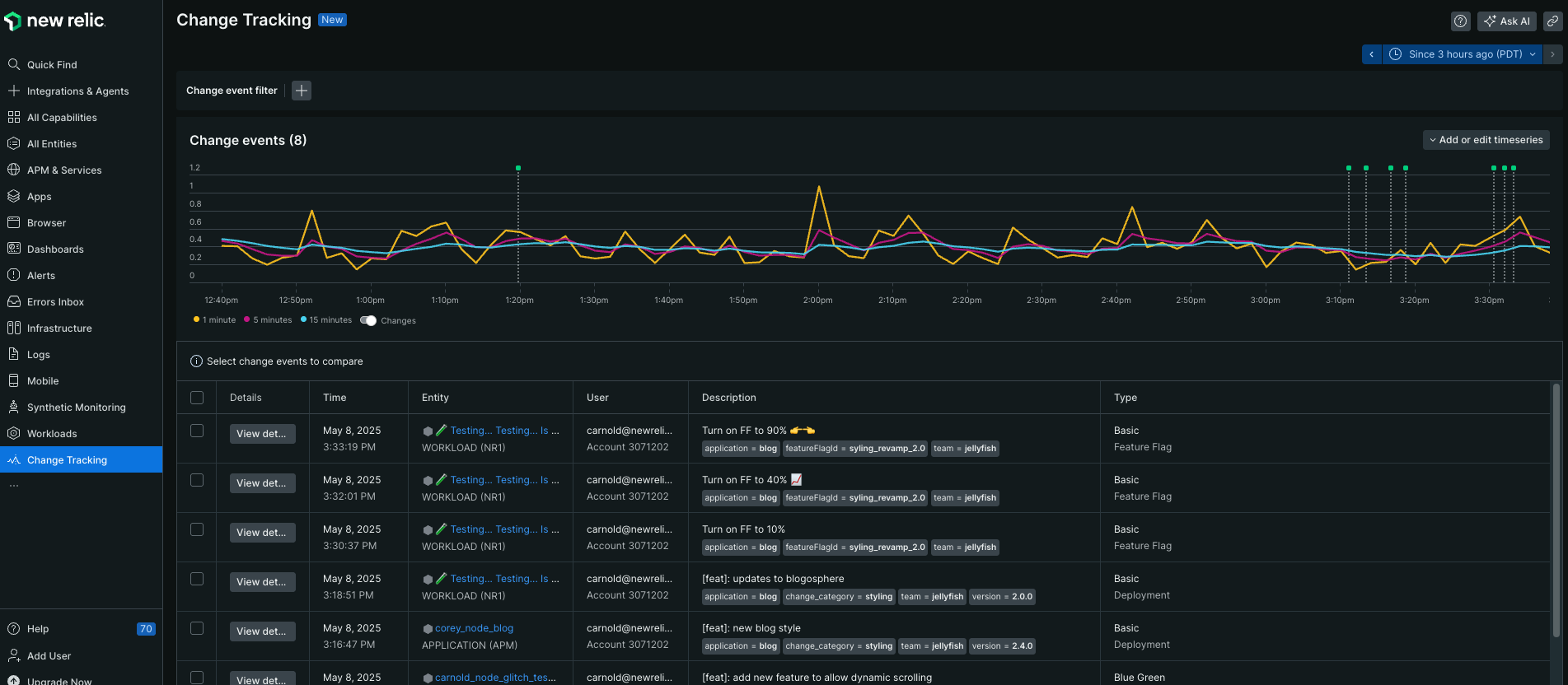
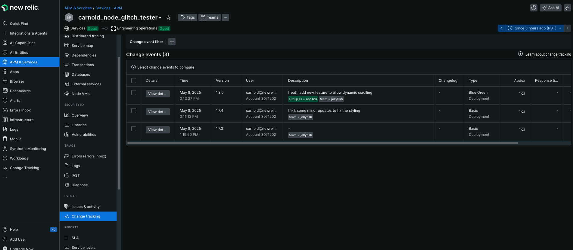
When you use the change tracking feature in New Relic, you can see how recent changes, such as deployments, affect your end users. For example, you can see app server Apdex scores, response times, throughput, and errors. You can view and drill down details, use search and sort options, hide or delete the error, share it with others, or file a ticket about it.
Before you jump into the details here about how to view and analyze the impact of changes, make sure you've designated the changes you want to monitor using GraphQL, our CLI, or a CI/CD integration. After you've designated which changes to track, you are ready to see the results from across your stack in a number of ways:
Charts in APM and dashboards: A vertical line with a pinhead appears on time series charts. This marker represents the recorded change, and if you click on the pinhead, you can start drilling into the impact the change had on entity health and quality.
Tip
If you land on a dashboard or entity summary page and don't see the tracked change you're expecting, check your time picker selection. It might be outside the window you are looking at.
Entity sidebar: To see a table of changes, click on Change tracking for any entity that has recorded changes. It features a time range selector and table filtering and sorting options. Use these to narrow the field of changes or to find a specific change.
Tip
Note that you may need to adjust the selected time range on this page to see tracked changes. Also, by default the table will only lazy load up to 2,000 changes. Keep this in mind as you're filtering, searching, and adjusting your time range.New Relic & Detection: If your change is related to an issue, you'll see it listed in the Root Cause Analysis section of the Issues page.
Activity stream component: You can see recorded changes in the activity feed on the right collapsible panel on various pages across the New Relic UI.
Analyze the impact of your change
How have your changes affected your systems? We offer a number of ways for you to analyze the effects of changes you're tracking.
Change details page
When you click on a change you're tracking in New Relic, such as on a chart or the Issues page, you'll open a Change details page. It contains the data you sent when you recorded the change plus a wealth of information about its impact.
You'll get various insights into how this change may have have affected this entity's health, performance, and quality. These insights are based on errors, key metrics and log attribute trends, anomalies, issues, and more. This page also features powerful scoping and comparison tools to help you see and understand even more context about ongoing changes. For example, you can see how your current change compares to the one before.
The Change details page.
Here are some helpful insights you can get by recording changes and leveraging other New Relic features:
Calculated net impacts of the change on key entity signals, such as throughput, error rate, transaction time, and more. You can see the net impact on a signal above each time series chart (typically shown as a percentage). Note that these net impacts are usually calculated by comparing averages or some other function of the signal before and after the change (hover over net impact figures to see before/after averages, etc.).
You can adjust the before/after period used in these calculations and displayed on time series charts via the timepicker at the top right corner of the change details page.
Tip
Pay close attention to the selected before/after time period as you analyze the impact of a change. If the period is too short or too long for your specific needs, just adjust it. Note that the UI will not calculate net impacts if elapsed time since the change is less than your selected before/after period because doing so results in skewed and generally unhelpful results.
Faceted findings from a variety of New Relic products including errors inbox, log monitoring, AIOps (issues, incidents, and anomalies), and more show how this change has affected or relates to crucial troubleshooting and analysis records. The insights featured here and how data is filtered will vary by entity type. Hover over titles of page sections to learn more about how we surface meaningful insights here.
Tip
The page-level timepicker also affects facet insights from other New Relic products. Try zeroing in on the time period after a change that matters most to you.
A link (See all changes on this entity) to a page containing the deployments list page filtered to this entity. Use this to quickly zoom out and see all recent changes on this part of your system.
Links to entities related to this change's entity. This helps you move across your stack as you look for the source of a problem or measure the impact of changes stemming from this change.
All the data supplied when the change was recorded, which helps anyone quickly understand context—regardless of whether they made the change or not.
Tip
When you record a change, try submitting a URL for the changelog attribute. The UI will render it as a clickable link that serves as a convenient jumping-off point to your source repo management system.
Change the before/after comparison period
The Change details page hinges on the idea that records and signals generated over a period of time leading up to this change are being compared with a period of equal length following this change. You can change the length of that period using a time picker in the top-right corner. Note that this will affect both time series charts and other UI elements featuring data-driven insights.
Tip
Remember that the relevance of net impact and average values depends on the timepicker selection. For example, if a change happened 30 minutes ago and you are comparing the hour before it to the hour after it, the relevance of some insights may be a little unbaked, so to speak, and in some cases the UI will not even attempt to display the result.
Compare one change to another
Next to the timepicker in the top-right corner of the Change details page, you will see compared with next to a dropdown menu. Using that dropdown menu, you can select another recorded change. This will toggle the page to a comparative mode.
When you compare changes:
Each time series chart will show a curve for THIS change and THAT change, which will help you compare the relative performance of each change.
Other calculations on this page will update to help you understand the difference between THIS change and THAT change. They may show increases/decreases in percentages for rates or counts (for example, +11) where it makes sense to do so.
You can open up to five stacked views of related changes.
See the effects of changes on metrics and events
To see how a change, such as a deployment, affects an entity's metrics and events, you can create custom trend boards. You have the option of creating up to three boards to help you make decisions about your recent change.
What can you see with these custom trend boards? You can select from any metrics or events available to your entity and then apply an aggregation function to it. For example, you could make custom trend boards that answer these types of questions:
- How has the average page view response time changed before and after this change?
- How has the max page view response time changed before and after this change?
Unlike regular dashboard charts, these custom trend boards are charts that are fully integrated with the time window and compared with settings on the Change details page. You can even export these to dashboards, and they are all tied to a specific entity and to your user account.
Here is an example of a single custom trend board for a tracked change. Two more boards could be added to this change.
To add a custom trend board:
- Go to one.newrelic.com > All Entities and select your entity.
- Click Change tracking in the left navigation pane, and select a change.
- Under the charts for Key impacts, click Add any metric or event.
- Click What do you want to track and select a metric or event.
- Click How do you want to aggregate that? and select a function.
See the effects of changes on web transactions
With change tracking, you can see details about how web transactions were affected by an APM application change. When you are tracking changes in APM applications, you'll see the heading Web transaction impacts. The table in this section shows performance indicators for up to ten of the application's most time-consuming web transactions:
To control what the table displays:
- Use the Metric dropdown to see how various metrics were affected by this tracked change.
- As you change the before-and-after time window in the table, keep in mind that if the time range after the change ends in the future, you may see incomplete transaction data.
- To get the table to show a side-by-side comparison with another tracked change, select another change in compared with.
- If you hover over a value in the Transaction name column, you'll see a tooltip summarizing the performance for all five metrics for that transaction. The tooltip also has links to the APM transaction details so you can dig into detailed transaction-level data.
Query change data
You can also query change data via NRQL (the query language for the New Relic database) or through NerdGraph (the New Relic GraphQL API).
Take a look at the NRQL and GraphQL sections below for some examples, or if you need more help using the query tools, see Introduction to NRQL, Introduction to New Relic NerdGraph, or NerdGraph entities API tutorial.
NRQL
After you create a marker using GraphQL, you can use NRQL in the query builder to create time series charts, draw curves for a telemetry signal over a span of time, and render changes as markers.
Try these examples or create your own queries:
Tip
For details about the data structure and attribute definitions, see our data dictionary.
NerdGraph (GraphQL)
Try these NerdGraph queries in our NerdGraph explorer:
What's next?
Consider setting up a webhook to notify your team about changes you're tracking. See Notify your team about changes.