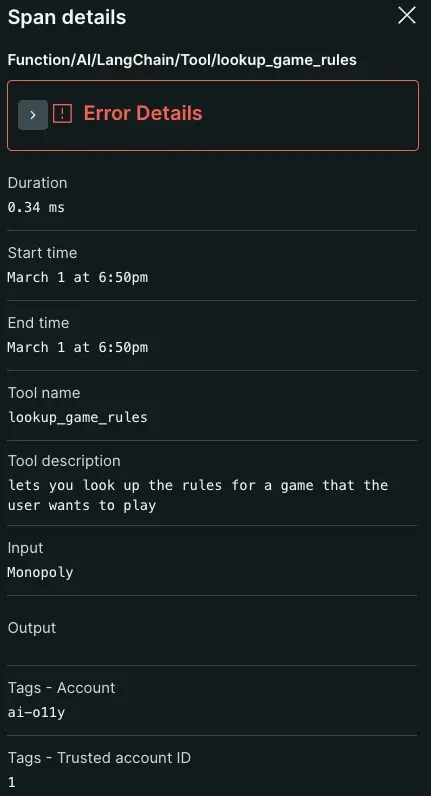
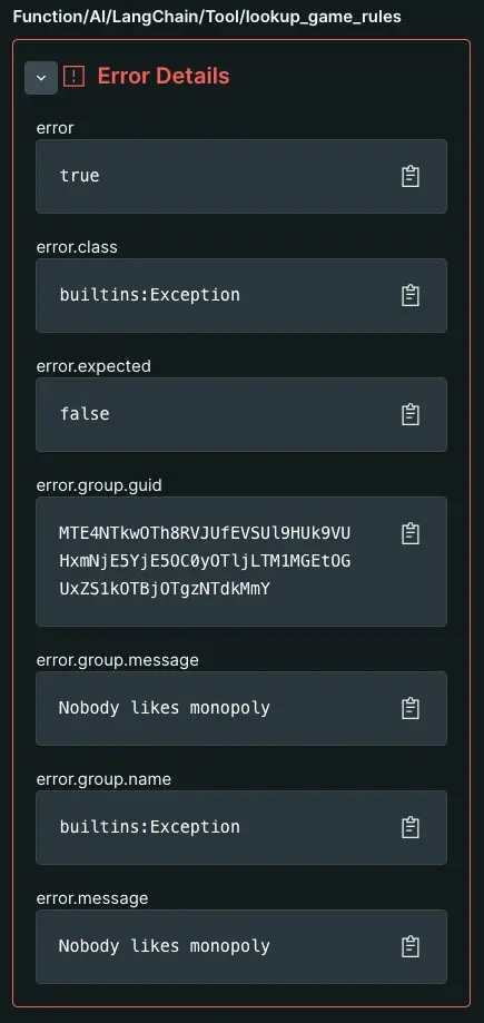
Enabling AI monitoring allows the agent to recognize and capture performance metrics and trace data about your app's AI-layer. With AI monitoring, you can track token usage, number of completions, and AI response time from your AI-powered app. When you see an error or an inaccurate response, you can scope to a trace-level view on a given prompt-response interaction to identify problems in the logic of your AI service.

You can view your data by going to one.newrelic.com > All Capabilities > AI monitoring. You can see your data from three different pages:
- AI responses: Overview aggregated data from all your AI entities. Track your AI responses, times, and tokens, or see data about individual prompts and responses.
- AI entities: View a table summary of all entities reporting AI data. See entities with standard APM data such as error rate, throughput, and app response time. When you select an entity, you can start exploring the APM AI responses page.
AI responses page
The top-level AI responses page shows your AI data in aggregate. Aggregated data takes the average total responses, response times, and token usage per response across all entities reporting AI data. On this page, response refers to an output from your AI-powered app when given a prompt.
If you own several apps with various implementations of different AI frameworks, you can get a general sense for how your AI models perform.
Track total responses, average response time, and token usage
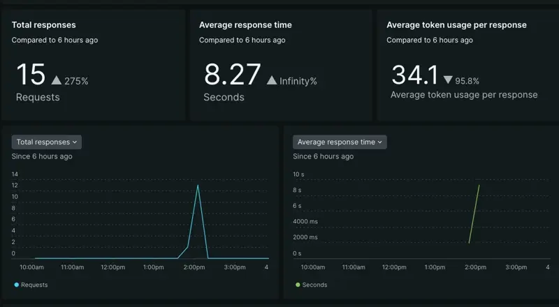
The three tiles show general performance metrics about your AI's responses. These tiles may not tell you the exact cause behind a problem, but they're useful for identifying anomalies in your app's performance.

- If you notice a drop in total responses or an increase in average response time, it can indicate that some technology in your AI toolchain has prevented your AI-powered app from posting a response.
- A drop or increase in average token usage per response can give you insight into how your model creates a response. Maybe it's pulling too much context, thus driving up token cost while generating its response. Maybe its responses are too spare, leading to lower token costs and unhelpful responses.
Adjust the time series graphs

You can refer to the time series graphs to better visualize when an anamolous behavior first appears.
- Adjust the time series graph by dragging over a spike or drop. This scopes the time series to a certain time window.
- Select the drop down to run comparative analysis for different performance parameters. You can choose between total responses, average response time, or average tokens per response.
- If you've enabled the feedback feature, you can scope the graphs to analyze responses by positive and negative feedback.
Evaluate individual AI responses
Your AI response table organizes data about interactions between your end user and AI app. You can view when an interaction occurred, prompts paired with their responses, completion and token count, and which model received a prompt.

You can adjust the table columns by clicking the cog icon in the upper right. This lets you choose the kinds of data you want to analyze.
The response table is an entry point into viewing trace data about an individual response. Click a row in the table to open the trace view of a particular response.
AI response trace view
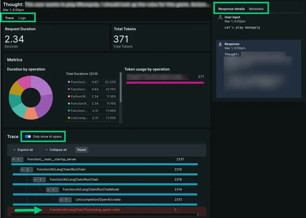
The AI response trace view gives you trace-level insights into how your app generates responses. You may want to look at the trace view to identify where an error occurred, or maybe you want to understand what led to negative feedback from a high token response. From the trace view, you can:
Choose between traces or logs. When you select logs, query within logs for text strings or attributes you want to investigate further.
Toggle between response details or metadata. The response details column shows the user prompt and AI response so you can maintain context for your traces and spans. Metadata provides a list view for entity GUID, model, tokens, and vendor.
When an error occurs, the waterfall view highlights its row in red. Select the row to open up span data, including the span's error details.
AI entities page
The AI entities page organizes all your entities currently reporting AI data into a table. This page displays your AI apps alongside response time, throughput, and error rate.
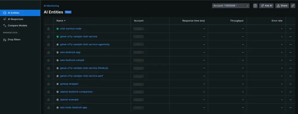
View the entities that report AI data: Go to one.newrelic.com > All Capabilities > AI Monitoring
Selecting an AI entity takes you to the APM summary page for that app. From the APM summary page, select AI monitoring in the left nav.
APM AI responses page
Selecting an AI entity takes you to the APM summary page. To find your AI data, choose AI responses in the left nav. We recommend using this page when you've identified that a particular AI entity has contributed to anomalies.
- The APM version of AI responses contains the same tiles, time series graphs, and response tables collected as the top-level AI responses page.
- Instead of showing aggregated data, the APM AI responses page shows data scoped to the service you selected from AI entities.
- While the top-level AI responses page lets you filter by service across all AI entities, the APM AI responses page limits filter functionality to the app's own attributes.
To review how to explore your AI data, you can follow the same patterns explained in the previous AI responses section.
What's next?
Now that you know how to find your data, you can explore other features that AI monitoring has to offer.
- Want to analyze data about calls made to your AI models? Check out our doc about the model inventory and model comparison pages.
- Concerned about sensitive information? Learn to set up drop filters.
- If you want forward user feedback information about your app's AI responses to New Relic, follow our instructions to update your app code to get user feedback in the UI.
