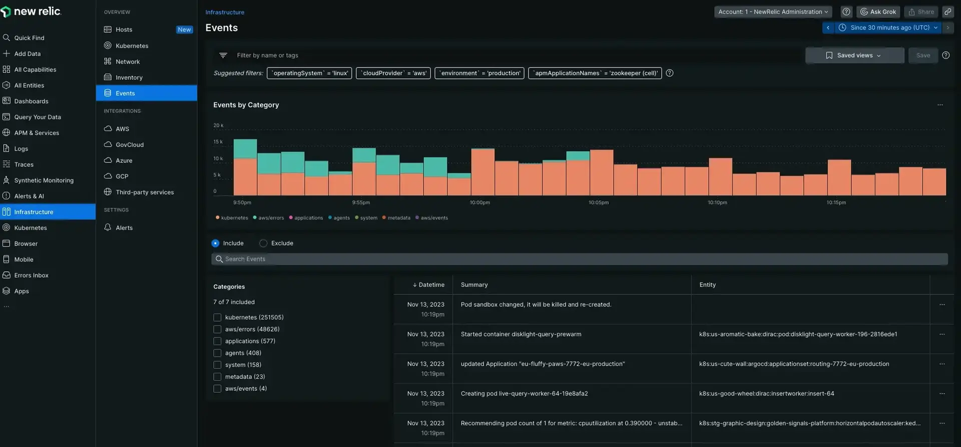
In our infrastructure monitoring UI, the Events UI page is a live feed of important system and host activity, including inventory change events, configuration changes, and log analytics events. The event feed helps you understand correlations between these events and system performance. Search and filter through your events to decrease the mean time to detect and repair infrastructure issues.
Tip
Note that event here has an infrastructure-specific meaning that is different from our event data type.
Find the Events page by going to one.newrelic.com > All capabilities > Infrastructure > Events.

one.newrelic.com > All capabilities > Infrastructure > Events: Use the Events to view important events happening in your system.
Event timeline
The events chart provides a snapshot of the infrastructure events occurring within the same time range as the displayed metrics. On hover you can see the number of events per color coded category to investigate any anomalous spikes.

one.newrelic.com > All capabilities > Infrastructure > Events: The events timeline shows patterns with events occurring at the same time period for the displayed metrics.
By comparing the timeline to the charts on the infrastructure page, you can quickly pinpoint issues in your ecosystem. For example, if a massive CPU spike occurs, you can click on the events timeline for that time range to find the event that caused it. From there you can dive deeper to uncover the real issue.
Event types
New Relic collects a variety of change events so you can understand each change in your environment:
Events | Comments |
|---|---|
Alert incidents | When an incident is opened or closed, New Relic generates an event indicating the host and associated alert condition. |
Agent connection | When an infrastructure agent connects to New Relic, our platform generates an Agent connected event. If New Relic doesn't receive data from an agent for three minutes, the platform generates an Agent disconnected event. |
Inventory changes | These events are generated when inventory data is added, removed, or modified. Select the source icon to to understand which category corresponds to the altered inventory path. For additional details, select an inventory event to see a side-by-side comparison of the old and new state. Inventory events can include:
|
Filter sets
To learn about filter sets, see Filter sets.
Chart data attributes
For an explanation of the data used to populate the Events page, see InfrastructureEvent attributes.